SRE: How to Count With Logs
Before an SRE can get into advanced anomaly detection or statistical models this SRE must first bring the skills of recording events and being able to count those events. If you are just starting this journey focus first on gathering events from a small service. Gather these in the form of logs.
A log message is an ordered record of a unique event.
Of course, ordered means we apply a time stamp to the log message. A record is an immutable account of an occurrence or event in the system where many useful details about that event are included. Many modern cloud based systems tend to be event oriented. It is these API calls, HTTP requests, DB queries, and other events that are most useful to track through the entire system. This blog series will focus on Apache events or HAProxy load balancer events as these are common and well understood components. Your system will have its own unique events that these same principles can be applied to.
Next, those events need to find their way into an Elastic Stack. This is a centralized logging system that is robust and Open Source. There are many solutions here from Amazon Elastic Service, Logz.io, building an ES cluster in house, or even running it in Docker Compose. There are many guides for getting an Elastic Stack up and running as well as routing Apache logs into it through FileBeat or similar. There’s a world of tangents right here, and plenty of help on the Internet to figure the technical parts out. Let’s move on to analyzing, or maybe just counting the data.
At some point, your log events will have a field added that will indicate
the type of data. This might be event.module:apache for ECS, but in
this example its type:apache.
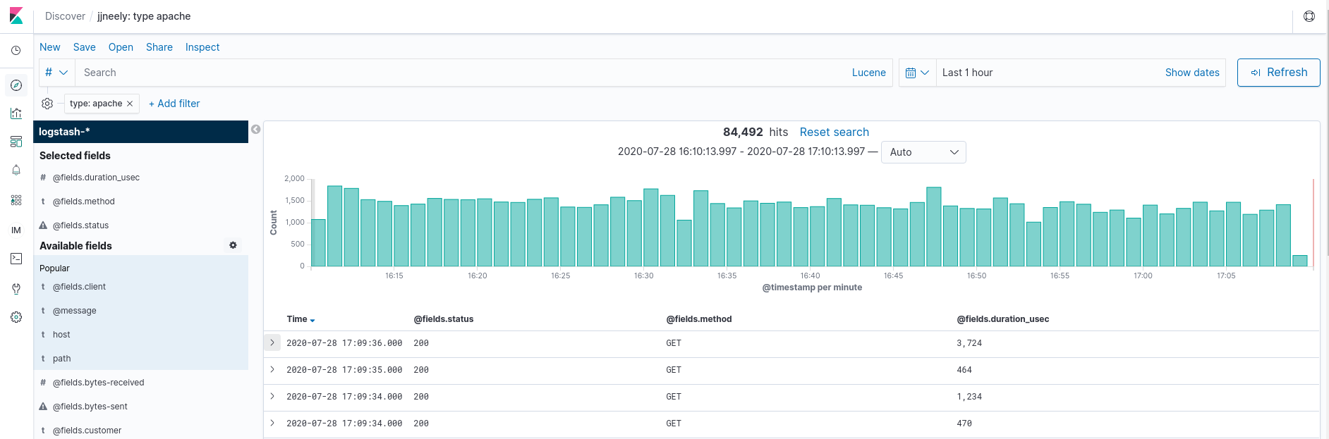
Here, I have set Kibana to only show certain fields in my Apache logs so that no sensitive information is present. This works because I have JSON structured logs that make them easier to parse. There are Grok rules to parse Apache log format data and the FileBeat solution above will do auto parsing as well.
Each row represents one specific Apache log and HTTP request. Notice that there are 84,492 matching events over the last 1 hour. Ah, a count! Also notice the histogram that shows a count of events per minute. Suddenly, this reveals a ton of information about the traffic patterns through Apache. Finding a count of hits over a specific time interval is easy! On top of having the Apache logs from many systems all in one place and a little graph to boot!
A lot of folks stop here, but not a Service Reliability Engineer.
Its important to understand the difference between the Population Set and the Sample Set. The Population Set represents the whole, where a Sample Set is a subset of the whole that is more feasible to measure attributes of to learn trends about the entire population. Such as using a randomly selected set of 5,000 people to represent the entire population of the United States. When you are counting Apache hits what constitutes a hit? What defines the Population Set of events? Does the Elastic Stack ingestion pipeline sample incoming events for scalability? What’s the ingestion failure rate? Knowing what the Population Set really is – is important. It allows accounting for error, and being able to re-inflate the Sample Set results to reflect the entire population.
The results that Kibana returns is usually treated as a Sample Set. It is the users’ responsibility to know if Elastic Stack is configured well enough to return a reliable Population Set or not. That set is further divided into smaller Sample Sets representing regular time intervals through the time range of the initial query. This allows Kibana to build Summary Statistics for a group of events inside a small time interval or bucket. These Summary Statistics are then graphed over time to produce reports and dashboards. In turn, these allow better understanding of the Apache traffic and the customer experience.
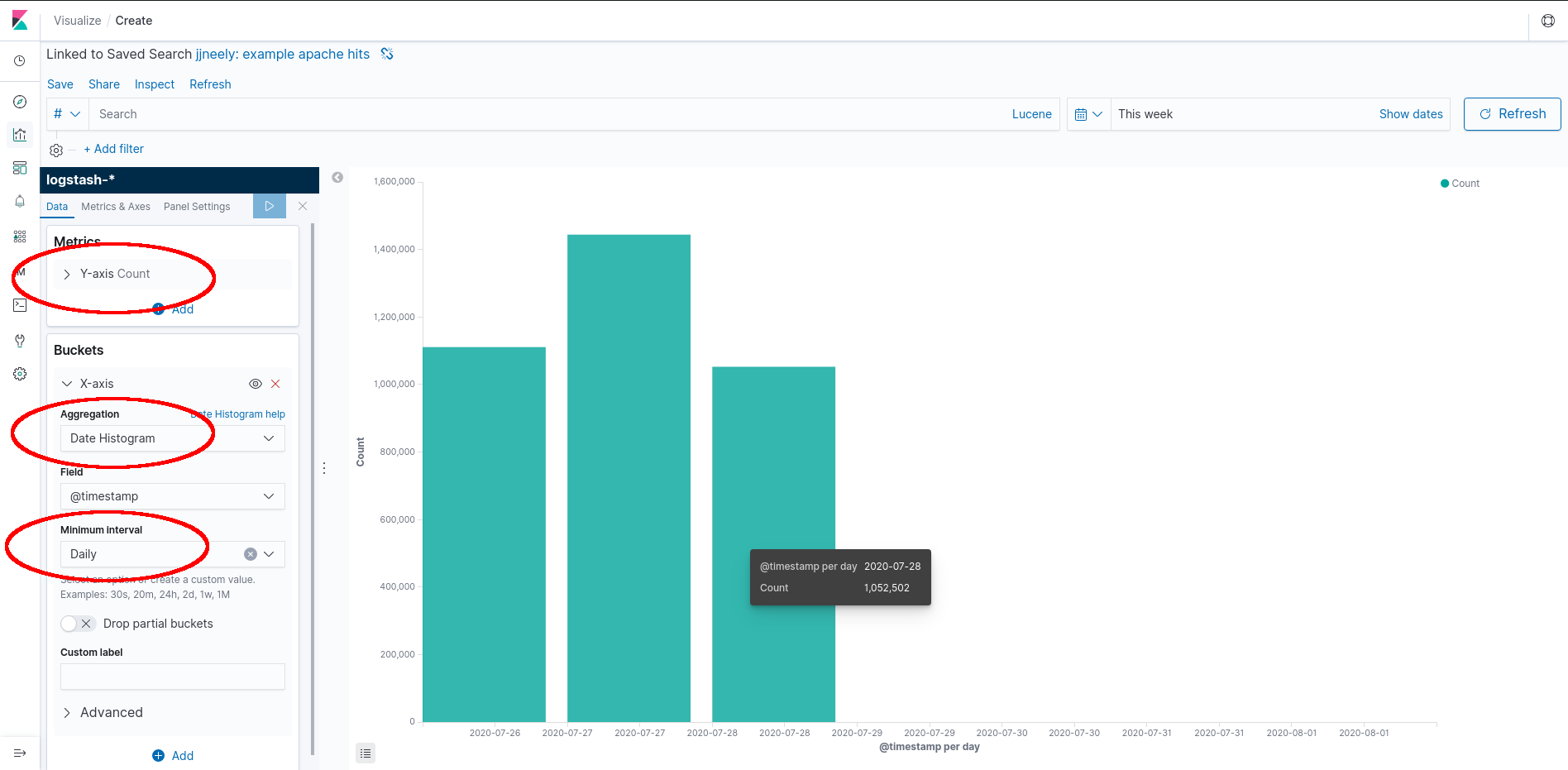
Here we have a Kibana powered and automated Report. A Report is a table or graph where time buckets are aligned to a logical value, such as the 24 hour day, and show accurate measurements for each time bucket. These can be useful for Business Intelligence and may be accurate enough to calculate customer billing provided the Elastic Stack is returning the Population. (This isn’t hard at all for small or medium sized setups.) By storing the events this report can be generated with high accuracy provided the sample set matches the population set to a very high degree. This is one of the major strengths of logging or event systems.
How is this built? Save the search from the Kibana Discover tab, pictured in the first image. Create a new Kibana Visualization that will be a bar chart. The defaults are usually one useless bar that counts all the events in the result. This is the Y-axis. Add buckets by expanding the X-axis tab, setting the aggregation to “Date Histogram” (show data over time), and finally, set the “Minimum Interval.” This should create a bar chart with bars for each interval aligned to that interval.
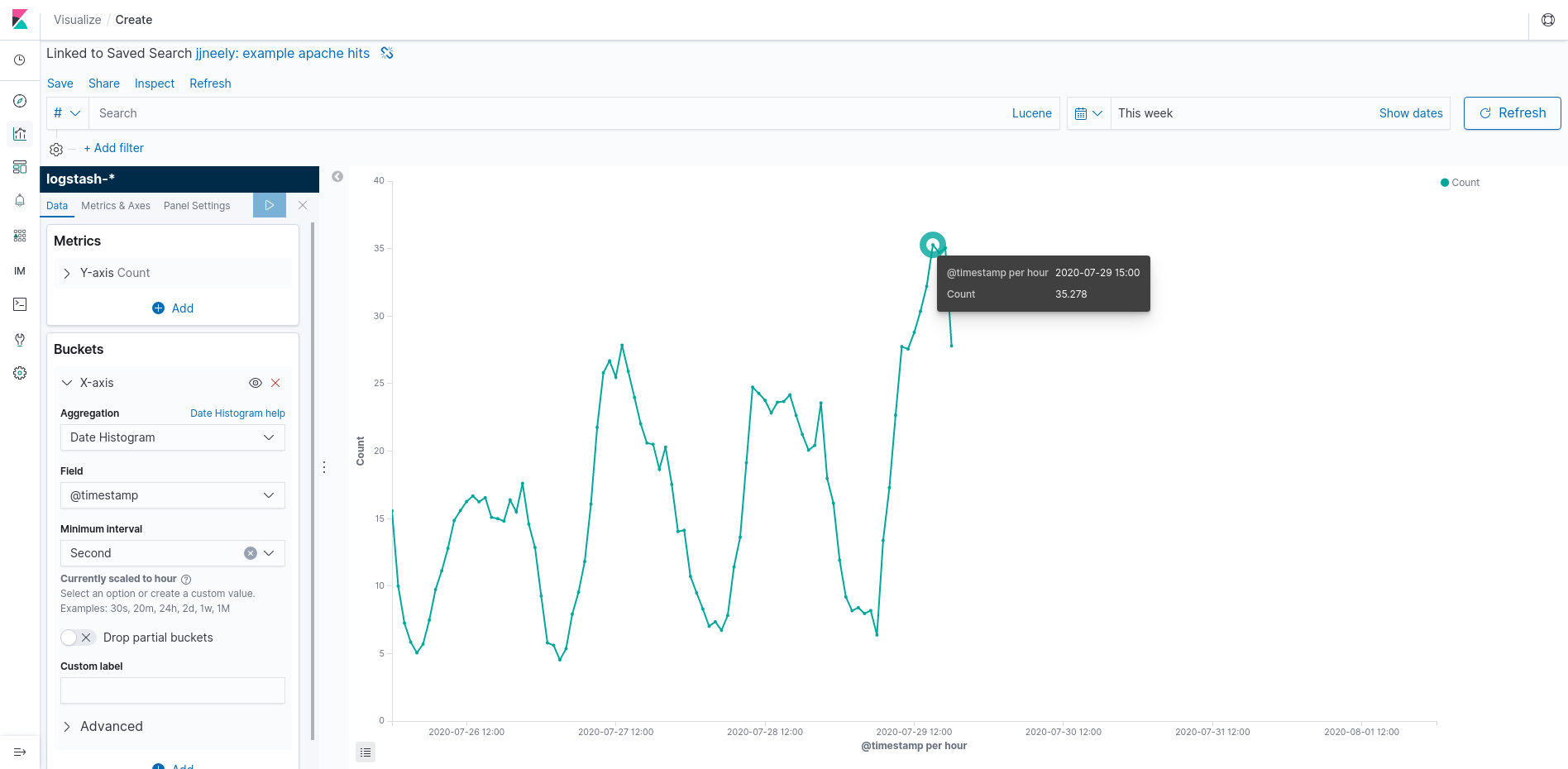
The other side is Operational Intelligence. These graphs and dashboards are usually aggregations with varying alignment including data that is up to the minute or even second. This style of graph is very important to the SRE team or Operations team to know how the application is performing right now. They play a major role in debugging problems and handling outages.
This Kibana visualization differs in that I’ve set the “Minimum Interval” to 1 second and used a line graph. This shows Apache hits per second. Use the rate per second as a standard yard stick. Its difficult (mathematically as well as visually) to compare rates in different units and this tip will make many dashboards much easier to read. Here, Kibana has chosen, in its great wisdom, that actual per second results wont display nicely on the graph. Instead, it is showing a per second rate averaged over an hour. Beware, this causes spike erosion, but we can zoom in on a time range to see more granular results. Notice that the per second rate always has a fractional component. This is, indeed, an aggregation and with some tools it might even be a linear approximation! That’s not wrong, its a summary statistic. But it can be important to know which summary statistic.
Here, a Service Reliability Engineer gets to check off one of the four Golden Signals used to judge the health of an application. At this point, an SRE can now measure Traffic rates per second. Understanding traffic rates is, obviously, very important to scaling an application. All we did to get here is a little counting!
Where does an SRE go from here? Well, another Golden Signal is knowing and understanding Capacity or Saturation. How full is the system? In web servers like Apache and load balancers, a big part of understanding capacity is how many concurrent connections can be handled. Now that we know how many connections per second are incoming, we can multiply this with a latency aggregation to get an understanding of active concurrent connections. There’s a trick, of course, HTTP keep-alive! But that’s another blog post.